5-2 Ministries / Brand identity
An identity rooted
in meaning.
A visual identity grounded in the ministry’s mission, with a consistent language for its brand applications.
Explore the artwork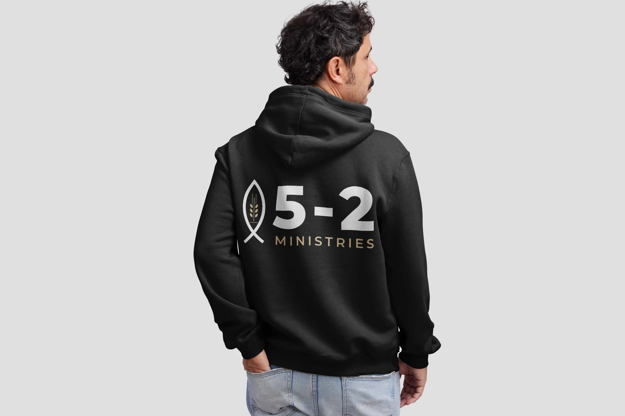
The brief
Create a visual identity connected to 5-2 Ministries’ mission of faith, hope, and transformation.
My approach
Use gold, navy, and a consistent typographic direction to connect the organization’s meaning with its visual identity.
The work
A cohesive identity and brand applications, developed with Luke Worden and the ministry team.
01 / The brief
Reflect the heart of the organization.
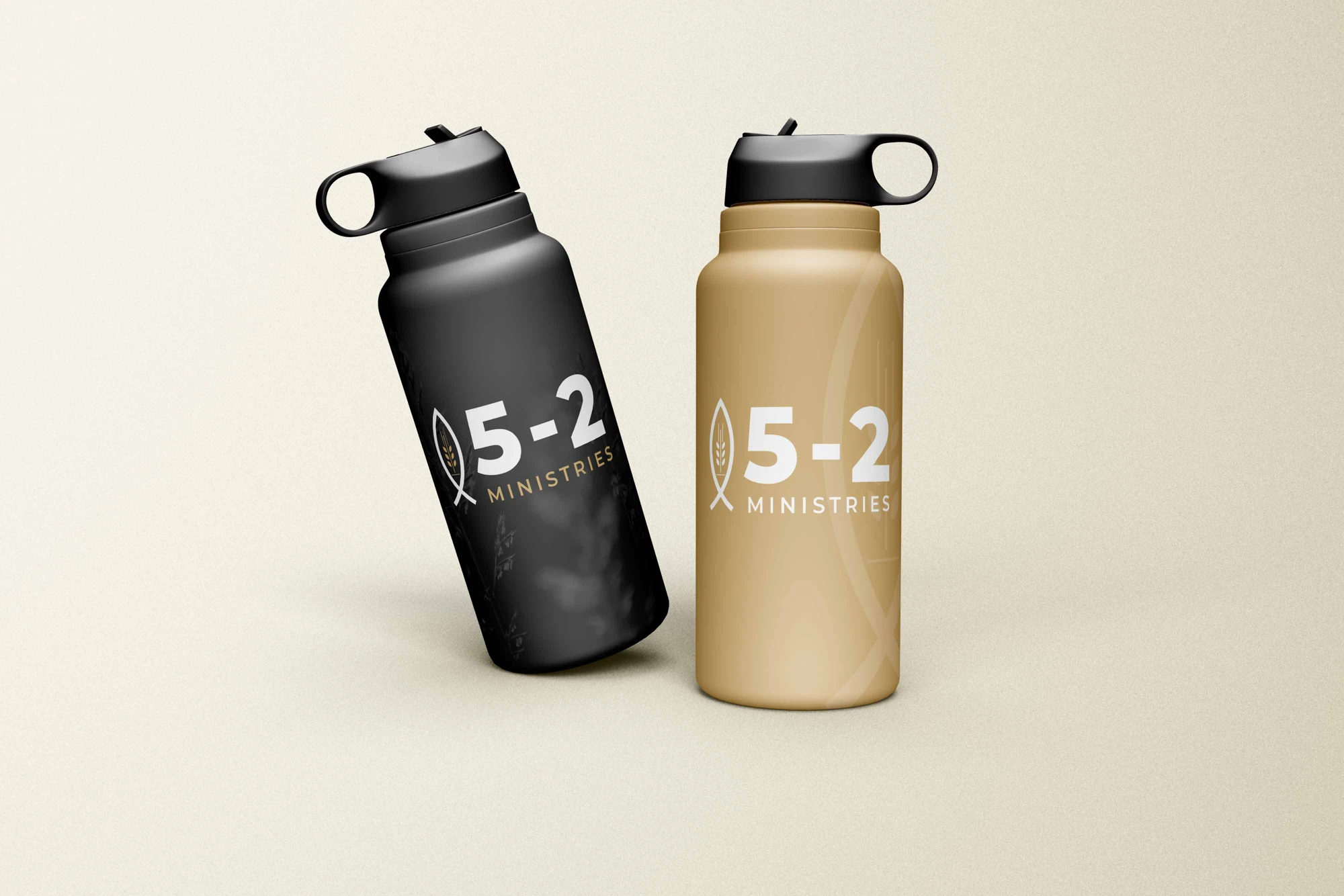
Working with Luke Worden and 5-2 Ministries, the goal was to create an identity connected to the organization’s mission of faith, hope, and transformation.
02 / The design decisions
Give visual choices a purpose.
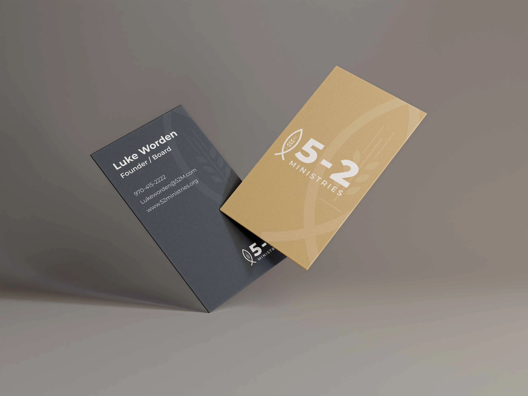
Gold connects to the royalty of Christ, while navy blue represents devotion and depth of faith. A versatile typeface helps unify the identity across its applications and merchandise.
03 / What was delivered
A cohesive identity with a personal connection.
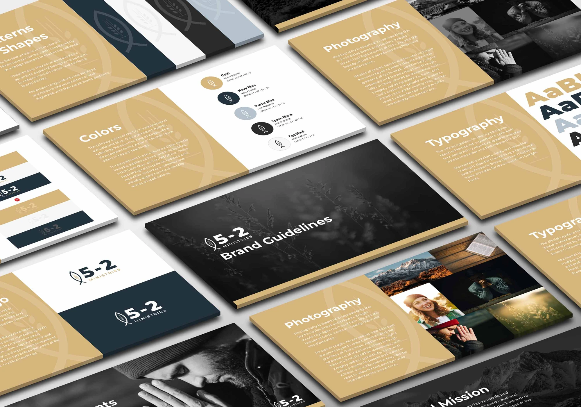
The final identity brings those choices together into a recognizable brand. Luke and the ministry team responded positively to the outcome, with a visual system they could carry into their communications.
- Visual identity
- Color and typography direction
- Brand applications
Next project / 01
 ← All selected work