In-Situ → Ott / Brand application & campaign design
A changing brand.
A connected experience.
As In-Situ transitions to Ott following the acquisition, my work brings the Ott identity into product launches, webinars and everyday marketing. These recent campaigns show the visual direction taking shape across digital and print.
The brief
Bring the Ott identity into product launches and webinar communications during In-Situ’s brand transition.
My approach
Connect product imagery, field photography, bold type, and curved image treatments, with different color emphasis for each campaign.
The work
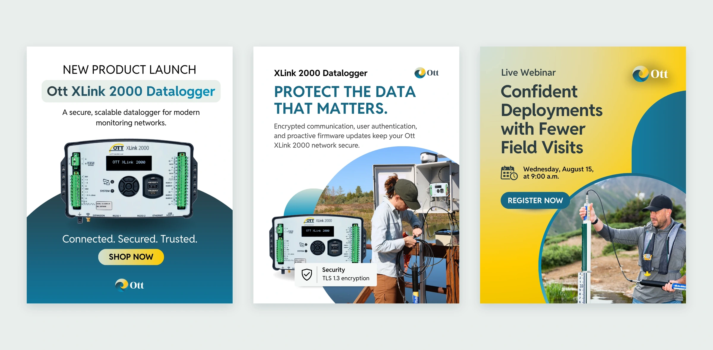
A connected set of product launch and webinar materials across social, email, print, presentations, and event displays.
01 / The brand today
Building continuity through change.
The In-Situ name will eventually give way to Ott, and future branding will feature the Ott logo. Working within the supplied corporate identity, I’m developing campaign applications that connect bold typography, teal and yellow, gradients and curved image treatments. The goal is a recognizable family of materials with room for different products, messages and audiences.
02 / Product launch
Introduce the product. Make its value clear.
The XLink 2000 Datalogger campaign moves from a product introduction into focused messages about security, storage and ease of setup. Product imagery anchors the launch, while field photography connects the technical benefits to the people using the equipment.




03 / Across formats
One launch, from inbox to event floor.
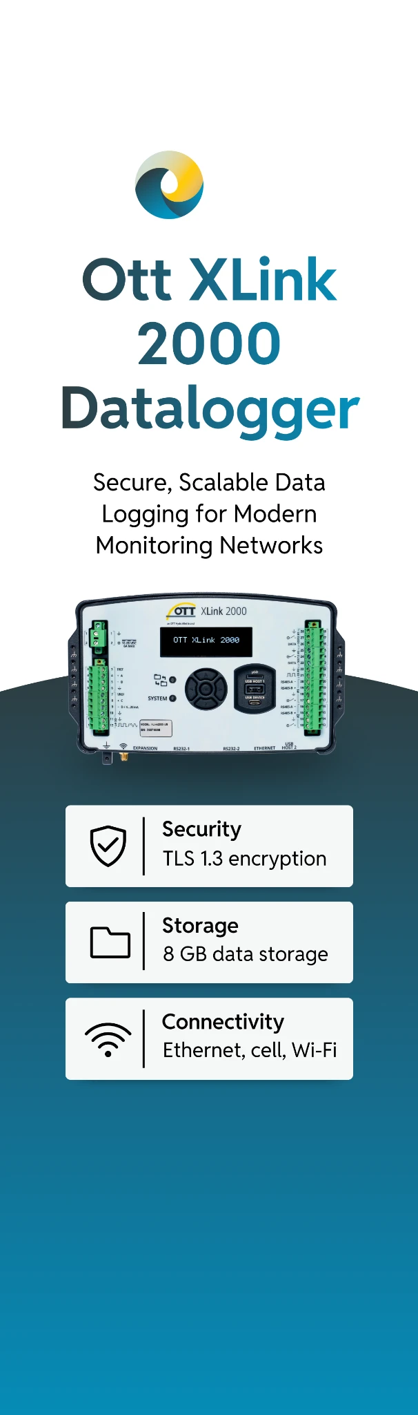
The launch direction extends into email, product literature and a pop-up display. Each layout adapts the information hierarchy to its format, keeping the product, key benefits and next step easy to find.


04 / Webinar campaign
A shared identity. A different conversation.
The webinar campaign applies the same visual language to product education. Yellow-led gradients distinguish the event materials, while field photography and presenter portraits offer different entry points into the topic: confident deployments with fewer field visits.



05 / The event experience
Carry the story through every touchpoint.
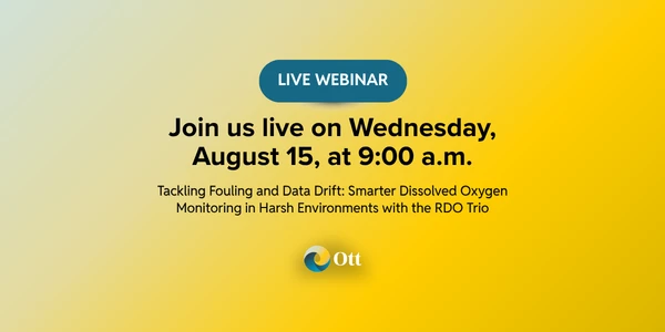
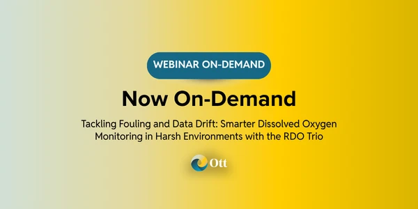
From registration promotion to the presentation itself and on-demand follow-up, the webinar materials keep the experience connected. The same shapes, color relationships and typography adapt to wide headers, a compact email signature and a slide deck cover.


The design approach
Consistency with room for variety.
White space gives product information clarity. Teal grounds the technical messages. Yellow and gradients add emphasis and distinguish the webinar campaign. Together, these choices show how I’m applying the Ott brand across different offerings while building a more cohesive body of work.
Next project / 03
 ← All selected work